March design inspiration
30 March 2017
It’s reached the end of march, the clocks have gone forward and spring finally feels like it’s here!
I've put together some of my favourite designs that I’ve come across this month.
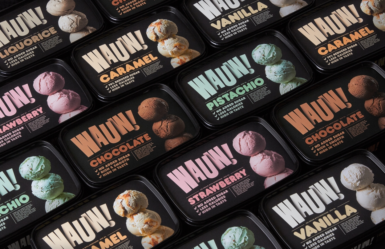
WAUW Ice cream packaging
A really standout packaging. The black really differentiates it from other ice creams and the bold logo really stands out, especially with the subtle shadows on it. Stacking the ice cream scoops on top of each other also makes for an interesting product shot that looks different to most others on the market.
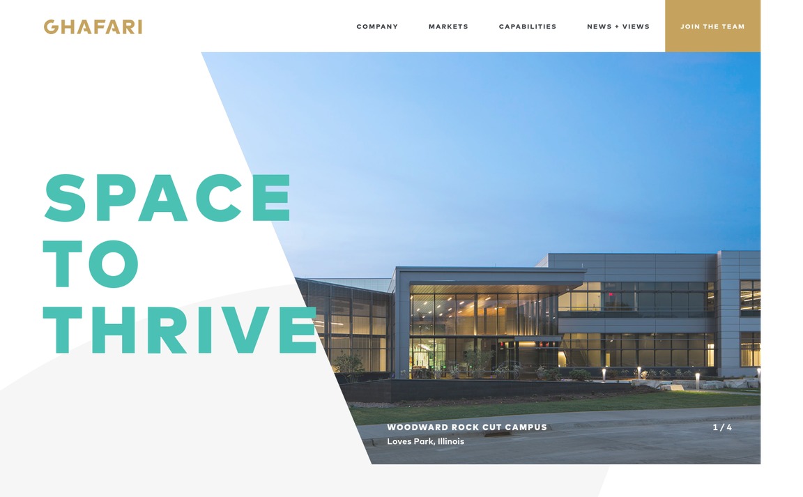
Ghafari
Really like that the image is cut into a similar shape that cuts into the A in the logo. I also really like the G in the background that follows you as you scroll down the page, and the title of the page as well. Quite a text heavy site for an Architecture site but it still works well since theres a lot of white space and it’s easy to read.
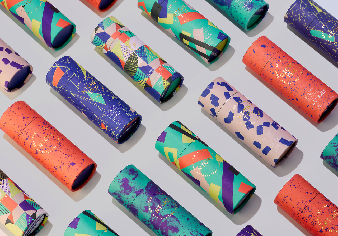
Unique tea by IWANT
Really interesting bold patterns and colours really make me really want to buy them all, despite not drinking tea. The gold foil on the logo also makes it feel a little more luxurious.
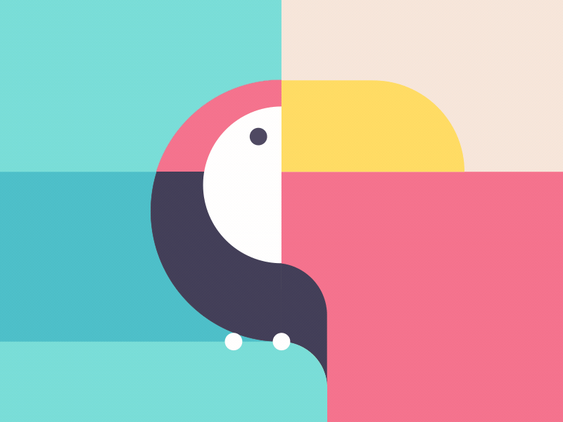
Animals by Dennis Hoogstad
A really fun gif I found on dribbble, definitely an interesting idea to have a toucan transform into a whale.
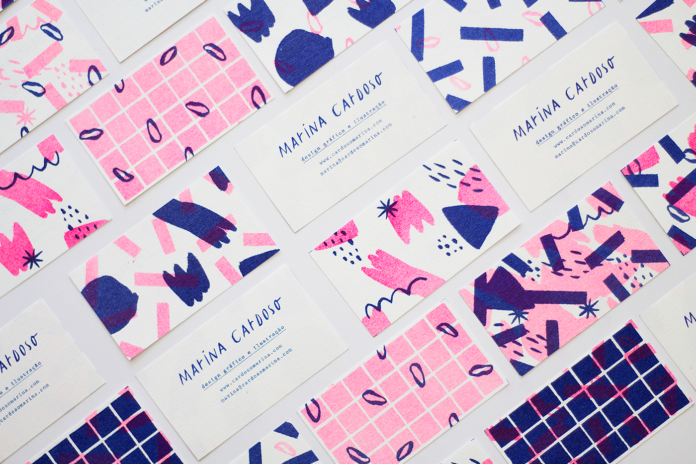
Marina Cardoso business cards
Another set of patterns, this time 2 colour hand-drawn illustrative ones for business cards. The two colours used help to bring together unique patterns for each business card into a cohesive set.
